
It was interesting having come across the early Eberhard Faber Pencil Company logo. It got me wondering as to what the image represented and perhaps where it came from. I didn’t have to look very far—it looks like it was taken from the Faber family crest:
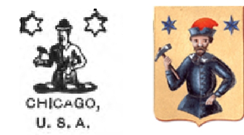
It features two six-pointed stars and what appears to be a craftsman with a hammer (though the Eberhard Faber craftsman looks like his ensemble may have been upgraded to an overcoat and a dapper bowler). The full Faber family crest was bestowed upon Lothar Faber in Germany when he was raised to baron in 1862:
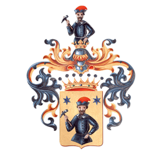
Heraldry is a deep field of study, especially with regard to symbols and their meaning so from this point forward I’m going to be painting with broad strokes. The symbol of a hammer, an arm holding a hammer, or a person wielding a hammer is associated with (among other things) craftsmen and trade guilds—something that makes perfect sense for 18th- and 19th-century Bavaria. So I thought I was really onto something when I compared the Faber-Castell family crest (left) with the crest of the city of Stein:
Looking at the shield of the Faber-Castell crest you can see the similarity to the Stein crest. I presumed it was the city crest which was being referenced in the Faber-Castell crest, but in fact it’s just the opposite: the Stein crest was created in 1949 and borrowed imagery from the family crest, which recognizes the more than 200 years of Faber patronage.
A heraldic star can mean many different things, including being a representation of God’s providence. The number of points the star has can mean different things too yet stars are rather common in crests, and not just those found in Germany. (I’d like to tell you what the two stars mean in the family crest but I’m sorry Dave, I’m afraid I can’t do that.)
I don’t yet know exactly when or why the Eberhard Faber Pencil Company stopped using the image from the crest in their logo, but I have a hunch. Eberhard’s first effort in the pencil business was as the American representative for A.W. Faber beginning in the mid-1800s. Along with selling A.W. Faber’s wares Eberhard also secured cedar from mills in Florida and began manufacturing his own pencils, which were of an admittedly lower quality. But an agreement remained for Eberhard Faber to be the managing agent in the U.S. for the family business, which was being run by his brother Lothar back in Stein.
There were disagreements here and there but the real trouble began when Eberhard started using “E. Faber” on the company’s products and advertising. Lothar felt this was a deliberate attempt to foster confusion between the two brands, to the benefit of Eberhard. A lawsuit was filed and eventually won by A.W. Faber in the early 1900s: Eberhard Faber could no longer use “E. Faber” (or put another way, any combination of initials followed by “Faber”) on its products or advertising. Right around the time of that ruling an ad appeared, and it’s something that may have been a sarcastic reference to the whole affair:
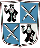
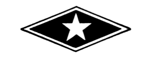
Also around this time, approximately 1903-04, a new logo appeared for the Eberhard Faber Company and what’s more, it incorporated a star:
It should be noted that by this time it was Eberhard Faber II running the business, his father having died in 1879, and Lothar Faber died in 1896 so the acrimony traversed two generations.
For all I know there may have been plans for a new logo before all of the legal trouble began but since the original logo was a direct reference to the family back in Germany, a new logo could have been a good way to start fresh after the lawsuit. Perhaps this first American-born Eberhard Faber was looking to distinguish—though not necessarily distance—himself from his family’s company which was now his competitor; remarkably the two companies would both sue and do business with one another at the same time for years to come. But by the time the First World War began anti-German sentiment was peaking in America: Eberhard Faber II would eventually do his utmost to distance himself from his German relatives by pleading his “American-ness”, in ads and op-eds placed in stationery trade journals, his pencils full of stars.


Sean, it’s great to see so much background. I updated my post on the Mongol 2 3/8 to include the 1903–1904 date. It’s wonderful to think that in 1960 they went with Diamond Star as a name for the Mongol’s lead, after the emblem had already been on pencils for years.
LikeLike
Thanks, Michael. A lot of it is speculation, but I have contacted some experts on the subject and hope to hear back from them shortly.
LikeLike
Thanks for this history of the Eberhard Faber-Castel logo. I do like their later star logo. Simplifying company logos is still very popular, but for EF it was a huge simplification – reading about the law suit in this context was very informative.
LikeLike
Thanks Memm. I’ve found out a bit more, including an additional logo. I hope to post another installment soon.
LikeLike
Pingback: WAR BETWEEN THE FABERS. | Contrapuntalism